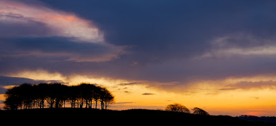
From the same spot I took this second image where I've zoomed into the area where the sun is behind the low clouds. I've cropped this image even wider than the previous image to leave just the horizon and the lightest area of the sky.
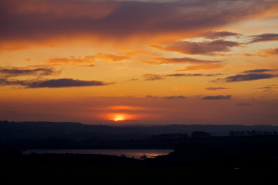
In the next image I have driven further along the road so that Ingbirchworth reservoir is in the foreground to provide a reflection of the sun as it rises. The top edge of the sun is now above the thicker cloud but still behind the thinner band of cloud above. It's interesting to see how the different patches of clouds in the foreground are being lit by the sun. Some are quite dark whereas others are much lighter and have warm orange linings.
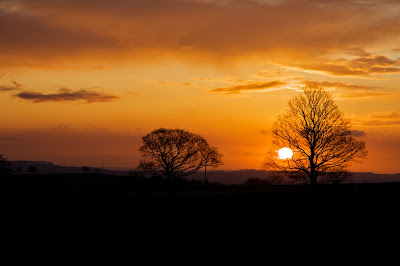
I moved further along again to a place where there are a couple of trees nearer to the road which I am using as the foreground interest. By now the sun was was well above the horizon but still behind the haze in the distance. The sky was getting much lighter now and the darker clouds had moved further away.
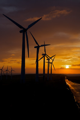
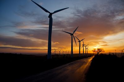
I then decided that it might be good to use the windmills as the foreground interest so the last couple of images are a portrait and a landscape versions of the scene. In the portrait version I have the wet road reflecting the sun and providing a leading line out to the horizon to the point where the sun is rising.
This last shot was taken a little later and the sun was quite bright, too bright really, so I positioned the small tree in front of the sun to cut down the direct light. I had also widened the zoom lens to include a greater area of sky and the patch of blue that was starting to grow. As with the previous image I am using the road as a leading line out to the horizon but this time it's a bit more dynamic with it being more on the diagonal of the frame. As I'm writing this blog, when I look at this image I feel there is too much dead space on the left and bottom so I have tried cropping those areas out. Looking at the cropped and uncropped images side by side I think I definitely prefer the cropped version. I ought really to upload the new version but maybe you can just imagine how it looks. Try looking at the full size image and cut out the left and bottom edges with bits of paper. What do you think?



1 comment:
I like it (cropped, that is) but if you do that you lose some of the road which, as you say, leads the eye nicely towards the sun.
Probably not the right thing to say but.."very pretty"!
Post a Comment